A massive “cup/handle” chart pattern has formed in the gold market, with the “cup” extending from late 2011 to August 2020 and the subsequent “handle” forming between late 2020 and the present.
The cup/handle technical pattern generally occurs over much shorter time periods and is regarded as a bullish continuation pattern that marks a consolidation period followed by a breakout.
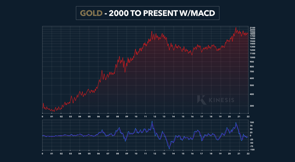
In the chart above, the Moving Average Convergence/Divergence (MACD) momentum indicator is slightly oversold because the way it is set up reinforces the technical argument for a prospective move higher in gold.
The cup/handle pattern which has formed over a 10-year time frame is likely to be extraordinarily bullish. A colleague of mine, who is well-schooled in technical analysis explains:
“the psychology underlying the cup/handle formation is that investors who buy on the left side of the cup, only to see their investment decline in value, will hold until the right side is formed; they sell in the handle because they ‘got back to even.'”
In the example, he speaks of a friend who had been holding his gold since 2011 and wanted to sell in the “handle” because he “got back to even.” It was my colleague who managed to talk him out of selling. He pointed out that the impulse sell at break-even reflects the mentality of many investors.
How the Golden Cup is Formed
The left side of the “cup” is formed as many investors who chase price higher turnaround and sell into the decline while some buying on the way down also sell as the price declines further. These are the so-called “weakest” hands. The bottom forms as the selling pressure subside.
As the investment fundamentals improve, buying outweighs selling though some investors who bought the left side of the cup sell their position when they “get back to even” on the way up. At the top of the right side of the cup, the last of the weak holder’s bail and the “handle” forms. At this point, most of the “weak” holders have sold out. If fundamentals support a move higher, new buying comes in and the price heads higher, and often, very quickly.
Market Fundamentals Similar to 2008
In terms of market fundamentals and risks, the current period is quite similar to the last quarter of 2008. Between late October and the last quarter of 2008, gold rose 22%, silver jumped 34.5% and the GDX mining stock ETF more than doubled.
Since the beginning of November 2022, gold already jumped up 12%, silver 34.2% (since mid-October) and GDX was up 31.7% (since mid-September).
The precious metals sector as represented by the gold price chart is at the point at which the probability of breaking out higher far outweighs the risk of a breakdown lower. This is supported by strengthening fundamental factors which include negative real interest rates, rising financial and economic risks, rising geopolitical risks and an eventual Fed pivot.
Dave Kranzler is a hedge fund manager, precious metals analyst and author. After years of trading expertise build-up on Wall Street, Dave now co-manages a Denver-based, precious metals and mining stock investment fund.
This publication is for informational purposes only and is not intended to be a solicitation, offering or recommendation of any security, commodity, derivative, investment management service or advisory service and is not commodity trading advice. This publication does not intend to provide investment, tax or legal advice on either a general or specific basis. The views expressed in this article are those held by Dave Kranzler and not Kinesis.